Interior Design Color Schemes: The Complete Room-by-Room Guide
Master interior design color schemes with expert palettes for every room — monochromatic, analogous, complementary, and whole house color combinations you can try today.
Every successful interior design color scheme follows three proportions: 60% dominant neutral, 30% supporting tone, 10% bold accent. Monochromatic schemes create calm, analogous color schemes create flow, complementary pairs create energy. Test any color scheme on your room with Homeify.
Interior Design Color Schemes: How to Create the Perfect Palette
Choosing a single color for a room is easy. Making three or four colors work together — on walls, furniture, textiles, and accents — is where most people freeze. The result? Another all-white room, or worse, an expensive repaint after a bold choice that looked perfect on the swatch but overwhelming on four walls.
The good news: interior color schemes follow predictable rules. The same principles that make a sunset visually satisfying — warm tones graduating into cool ones, contrast between light and dark — apply directly to your living room. Professional decorators don’t have a mysterious “eye for color.” They use a system built on monochromatic, analogous, and complementary color schemes. This guide gives you that system.
We start with the color wheel and the three fundamental interior decorating color schemes. Then we walk through specific, tested home interior color schemes room by room — with exact palettes you can apply this weekend. Every recommendation comes with a practical alternative for smaller budgets, and every room section links to a dedicated page with deeper inspiration.
Color psychology research suggests that the colors in your home affect mood, perceived room size, and even sleep quality. Studies consistently link cool blue and green bedroom tones to longer, more restful sleep, while saturated reds and purples tend to overstimulate. Choosing the right color combinations is not just about aesthetics; it’s about how you’ll feel living in that space every day.
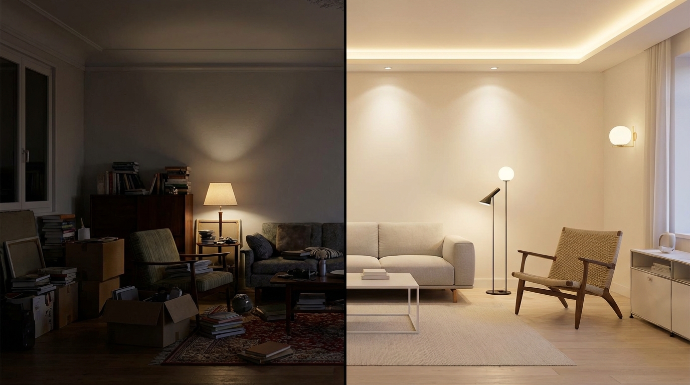
If you’d rather see before you commit, Homeify lets you photograph any room and preview dozens of palettes and styles in seconds — removing the guesswork entirely.
Understanding the Color Wheel: The Foundation of Interior Color Schemes
The chromatic circle is the single most useful tool for creating harmonious color associations. Every professional decorator, painter, and designer references it. Once you understand how it works, choosing colors that “go together” stops being a mystery and becomes a repeatable method.
Complementary Colors: Maximum Contrast
Complementary colors sit directly opposite each other on the color wheel: blue and orange, red and green, yellow and violet. These pairings create the strongest visual contrast — they vibrate against each other and demand attention. In interior design, use complementary pairs when you want a room to feel dynamic and energized.
The trick is proportion. Never use two complementary colors in equal amounts — the room will feel like a sports jersey. Instead, make one color dominant and the other a punctual accent — cushions, a vase, a single armchair. Navy walls with burnt orange throw pillows. A sage green kitchen with a copper pendant light. That’s complementary contrast done right.
Analogous Color Scheme in Interior Design
An analogous color scheme uses colors that sit next to each other on the wheel: blue, blue-green, and green, or orange, red-orange, and red. These combinations feel naturally harmonious because they share undertones. An analogous color scheme in interior design is ideal for bedrooms, reading corners, and any space where you want calm without monotony.
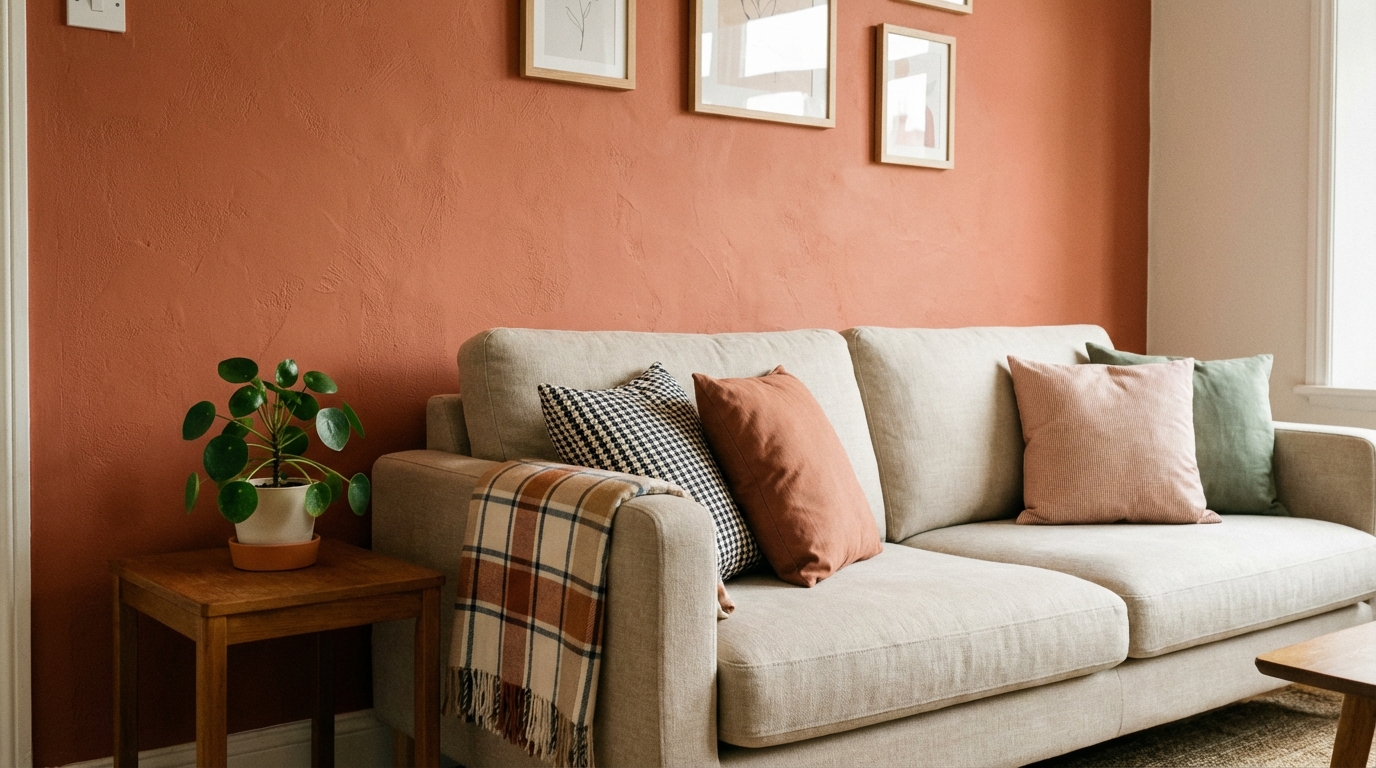
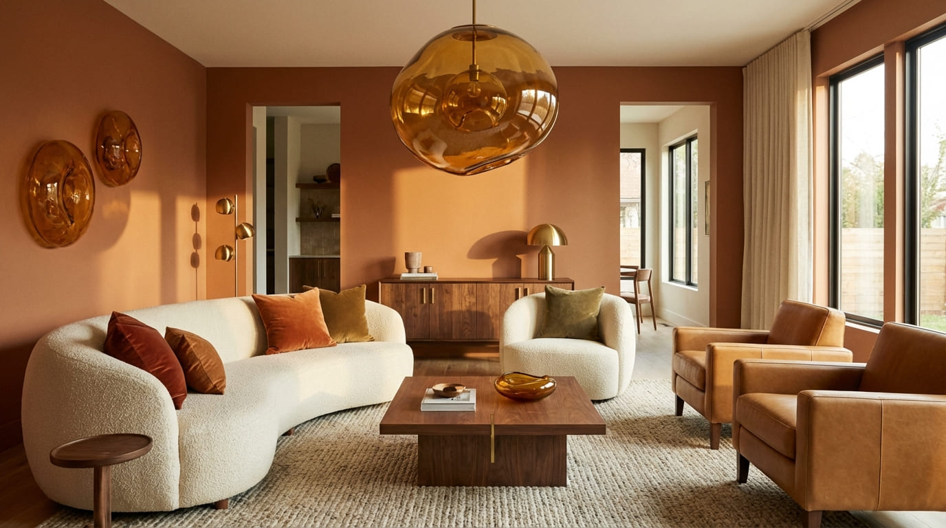
A classic analogous palette for a living room: warm beige, terracotta, and dusty pink. All three share a warm undertone, they flow visually across walls, cushions, and a rug, and none compete for attention. Add a touch of dark walnut wood for grounding and the room feels intentionally designed — not decorated.
The 60-30-10 Rule in Practice
This is the proportion formula that eliminates guessing. Apply it to any room:
- 60% dominant color — walls and the largest surface areas. Usually a neutral: warm white, greige, soft sand, or pale grey
- 30% secondary color — sofa, curtains, a large rug. A richer tone that complements the dominant: camel, sage, dusty blue
- 10% accent — throw pillows, artwork, a statement lamp, decorative objects. The boldest color: mustard, teal, burgundy, coral
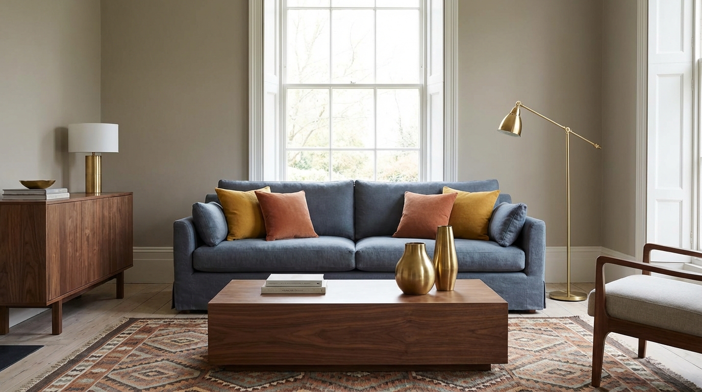
A living room example: warm linen walls (60%), a slate blue sofa (30%), and mustard yellow cushions (10%). The proportions prevent any single color from overwhelming the space while keeping it visually interesting.

Living Room Interior Color Schemes
The living room is where your palette sets the tone for the entire home. Visitors form an impression in the first seven seconds — and color drives that impression more than furniture or layout.
Warm Neutral Foundations
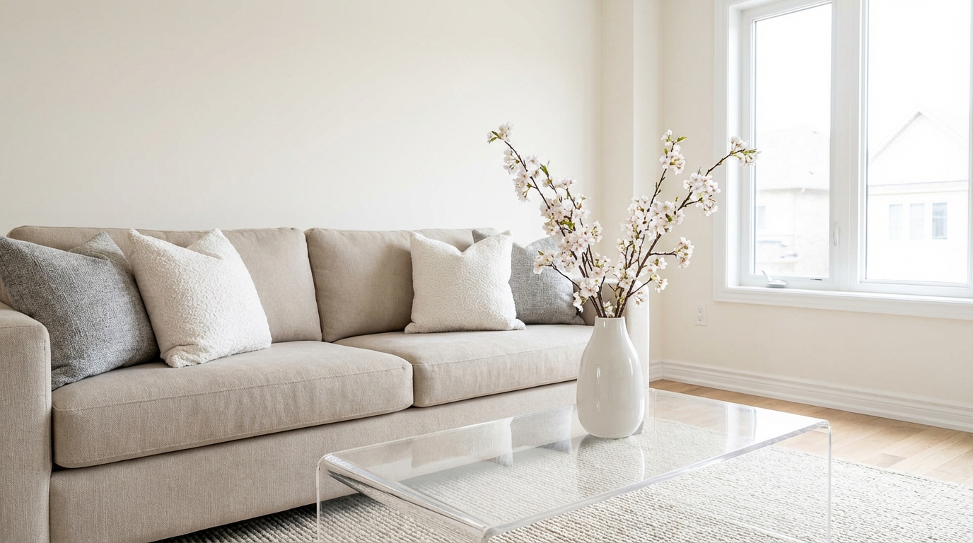
The safest and most versatile living room base is a warm neutral: greige (grey-beige), warm white with yellow undertones, or soft sand. These work with virtually any accent color and make the room feel larger and brighter. Avoid pure cool white — it reads clinical under artificial light and clashes with wood tones.
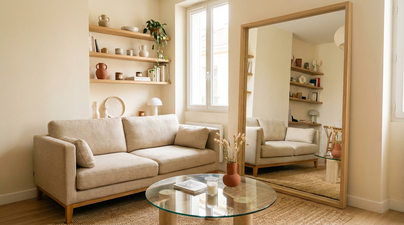
For a warm beige living room, layer textures to prevent blandness: a linen sofa in oatmeal, jute rug, rattan accent chair, and raw oak coffee table. The monochromatic warmth feels sophisticated, not boring, because each surface has a different texture catching light differently.
Bold Accent Strategies
Once your neutral base is set, introduce contrast. The most impactful accent in a living room is a single colored wall — not all four. A deep teal accent wall behind the sofa, paired with warm wood shelving and a few brass accessories, creates a focal point that grounds the entire room.

Trending 2026 accent pairings for living rooms:
- Terracotta wall + cream furniture + dark walnut accents — earthy, grounded
- Deep teal cushions + warm beige walls + brass lighting — sophisticated contrast
- Sage green armchair + warm white walls + natural wood — Japandi-style calm
- Mustard throws + charcoal sofa + mid-century walnut legs — mid-century modern energy
Kitchen Color Schemes
Kitchen color decisions are permanent in a way living room choices aren’t — you’re committing to cabinet finishes, countertops, and backsplashes that stay for years. This makes getting the combination right especially important.
High-Contrast Pairings
The most striking kitchen palettes use dark-light contrast. A black kitchen — matte black cabinets with a light oak countertop and white marble backsplash — is one of the highest-impact combinations in modern design. The key is balance: dark cabinets need a lighter counter and open shelving to prevent the space from feeling like a cave.

Other high-contrast kitchen combos:
- Dark green cabinets + brass handles + white countertop — classic and unexpected
- Navy lower cabinets + white uppers + butcher block counter — timeless two-tone
- Charcoal island + white perimeter cabinets + warm wood ceiling — depth without heaviness
Cabinet and Wall Coordination
When cabinets and walls compete, the kitchen feels chaotic. The rule: if your cabinets are bold, your walls should be neutral — and vice versa. White cabinets can handle a sage green wall. Dark charcoal cabinets demand warm white or very pale cream walls. Never pair a strong cabinet color with a strong wall color unless you’re deliberately creating a tonal room (all-green kitchen, for example — which works beautifully if you vary the shades).
Bedroom Color Harmony
Bedrooms are the one room where color psychology matters most. You spend eight hours a day immersed in these colors, and research consistently links cool, muted tones to better sleep quality. This doesn’t mean boring — it means intentional.
Monochromatic Color Scheme for Bedrooms
A monochromatic color scheme in interior design uses variations of a single color family — light to dark — across walls, bedding, and accents. This approach is the most restful of all interior design color schemes because the eye never jumps between competing hues.

A white bedroom layered with ivory sheets, a linen headboard in pale sand, and warm cream curtains feels like sleeping inside a cloud. The trick to making a monochromatic color scheme interior design work: vary the textures dramatically. Matte paint, satin bedding, chunky knit throws, smooth ceramic lamps — all in the same color family, but each surface feels distinct.
Accent Wall Colors That Help Sleep
If you want color in the bedroom, choose one wall (typically behind the headboard) and keep the other three neutral. Colors that enhance sleep:
- Soft sage green — calming, associated with nature and rest
- Dusty blue — the classic “good sleep” color per multiple studies
- Warm blush pink — softer than it sounds; creates a cocoon effect at night
- Muted lavender — gentle enough to relax, distinctive enough to add personality
Avoid saturated red, bright yellow, or electric blue on bedroom walls — they stimulate rather than calm. Dark tones like navy or charcoal can work if balanced with lighter bedding and warm lighting at 2700K.
Bathroom Interior Design Color Schemes
Bathrooms are the only room where you can go bold without long-term commitment risk — towels and accessories are easy to swap. Use this freedom to experiment with color associations you might hesitate to try elsewhere.
A modern bathroom in 2026 favors textured stone in warm neutral tones as the base, with color introduced through tiles and accessories. The most effective bathroom palettes use contrast between hard surfaces and soft tones:
- White subway tile + warm terracotta accessories + light oak vanity — Mediterranean calm
- Green zellige tile accent wall + white fixtures + brass fittings — spa-like and current
- Grey concrete-look tile + black matte fixtures + warm wood accents — industrial chic
- Pale pink walls + white marble vanity + gold accents — soft glam
The 60-30-10 rule applies even here: tile color at 60%, vanity and fixtures at 30%, towels and accessories at 10%.
Small Bathroom Color Tricks
In bathrooms under 5 square meters, color choices directly affect perceived size. Light, cool-toned tiles (pale grey, soft aqua, warm white) make walls appear to recede, opening the space visually. A single strip of darker contrast tile — at eye level along one wall — creates horizontal emphasis that widens narrow rooms. Avoid dark floors in small bathrooms; they anchor the eye downward and make the ceiling feel lower. If you want drama in a compact space, try a bold ceiling color instead (deep teal or navy) — it draws the eye upward and feels unexpected without shrinking the room.
Home Office and Dining Room Colors
Colors That Boost Focus
Your home office needs colors that support concentration without creating visual fatigue. The sweet spot is a neutral base with one strategic accent. Deep navy or forest green on the wall behind your screen reduces eye strain (dark surfaces behind bright screens lower contrast glare), while keeping the remaining walls in warm white or soft grey maintains brightness for video calls.
Materials matter: a warm wood desk (oak, walnut) paired with matte painted walls creates a surface contrast that feels grounded. Avoid high-gloss finishes on walls — they reflect screen light and cause headaches during long work sessions. A desk lamp at 2700-3000K (warm white) complements the palette without washing out on-screen colors. Scandinavian-style offices — light wood, white, one muted accent — remain the most popular choice for remote workers in 2026.
Dining Room Ambiance
The dining room is one of the few spaces where warm, saturated color actually improves the experience. Rich tones like burgundy, deep terracotta, or dark olive green make evenings feel intimate and food look better under warm lighting. A statement pendant light at 65-75 cm above the table in brass or matte black completes the atmosphere.
Keep the ceiling lighter than the walls — this prevents the room from feeling compressed. A deep-toned wall with a warm white ceiling creates a natural “container” effect that draws people together around the table.
Entryway and Studio Apartment Color Schemes
Your entryway sets the first impression. A bold color choice here — a saturated teal, warm terracotta, or deep sage — works because the space is small and transitioned through quickly. Visitors register the color as a statement, not as overwhelming. Pair with a slim console table no deeper than 30 cm, a round mirror to expand perceived space, and a single overhead light in warm white.
For studio apartments, color becomes a zoning tool. Use a distinct interior color scheme to visually separate living, sleeping, and working areas within one open space. A bohemian-style studio might use warm terracotta in the living corner, muted sage in the sleeping area, and crisp white at the desk — all connected by natural wood flooring that runs as a whole house color scheme throughout.
Trending Interior Design Color Schemes for 2026
The 2026 decor trends have shifted the conversation around house color schemes for interior design decisively. Cool greys and stark whites are out. Warm, organic, personality-driven interior color schemes are in.
The five combinations you’ll see everywhere this year:

- Terracotta + cream + walnut — the “warm earth” palette replacing grey-and-white
- Deep teal + warm beige + brass — sophisticated contrast with metallic warmth
- Sage green + linen white + light oak — minimalist but not cold
- Burgundy + blush + dark wood — dramatic and layered
- Ochre + charcoal + raw concrete — urban warmth with an industrial edge
These palettes work because they follow the fundamental principles: warm dominant tones, controlled contrast, and textural variety. With Homeify, you can test all five on a photo of your own room and decide which resonates before spending a cent on paint or furniture.
Common Color Mistakes to Avoid
Even well-intentioned color choices fail when basic principles are ignored. Here are the five mistakes that cost homeowners the most money and frustration:
- Choosing paint under store lighting. Hardware store fluorescent bulbs distort every color. Always take the swatch home and tape it to your wall for 48 hours — observe at morning, midday, and evening before buying. Better yet, use AI visualization tools to preview the exact color on your walls instantly.
- Ignoring undertones. Two “whites” can clash if one leans blue and the other yellow. A warm white wall next to a cool white ceiling creates a jarring mismatch. Always compare swatches side by side in natural light.
- Using two strong colors in equal proportions. A room that’s half burgundy and half teal feels like a carnival tent. Stick to the 60-30-10 rule — one color must dominate.
- Forgetting about floors and fixed elements. Your floor color, countertops, and tile are part of the palette. A warm terracotta wall clashes with a cool grey tile floor. Start from what you can’t easily change (floor, counters) and build the palette around those.
- Painting the entire room as a test. A full room repaint costs 150-400 € in materials alone. Paint two large patches (at least 50 cm square) on different walls first — one in direct light, one in shadow.
Whole House Interior Color Schemes at a Glance
| Room | Recommended Palette | Key Color Pair | Atmosphere |
|---|---|---|---|
| Living Room | Warm neutral + one bold accent | Greige walls + teal accents | Welcoming, balanced |
| Kitchen | High-contrast dark/light | Matte black + light oak | Striking, modern |
| Bedroom | Monochromatic cool tones | Dusty blue + warm cream | Restful, serene |
| Bathroom | Stone base + tile accent | Green zellige + white marble | Spa-like, fresh |
| Home Office | Neutral base + deep accent wall | Warm white + forest green | Focused, calm |
| Dining Room | Warm saturated tones | Burgundy walls + brass lighting | Intimate, convivial |
| Entryway | Bold single statement | Teal wall + warm wood | Memorable, confident |
| Studio | Zoning through palette shifts | Terracotta + sage + white | Defined, airy |
Every interior design color scheme above follows the same principle: a clear dominant tone, a supporting secondary, and a punctual accent. These whole house interior color schemes work because each room has its own accent while sharing a neutral base. Adjust the proportions to your room’s size and light — smaller rooms benefit from lighter dominants, while larger rooms can handle darker, more saturated walls.
Frequently Asked Questions
The most reliable interior design color schemes follow the 60-30-10 rule: 60% neutral dominant color (warm white, greige, soft beige), 30% supporting tone on furniture and textiles, and 10% bold accent. Complementary color schemes — like navy blue and burnt orange — create visual energy, while analogous color schemes (adjacent colors on the wheel) feel calmer and more cohesive.
A monochromatic color scheme in interior design uses variations of a single color family — from light to dark — across walls, bedding, and accents. For example, a bedroom in cream, sand, and ivory tones creates a restful atmosphere. The key is varying textures (matte paint, satin bedding, chunky knit throws) so the room feels layered, not flat.
Start by choosing one neutral base tone that flows through every room (warm white, greige, or soft sand). Then assign each room its own accent from a cohesive palette — sage green in the bedroom, teal in the living room, terracotta in the entryway. The shared neutral ties the whole house color scheme together while each room keeps its own personality.
The 2026 interior color schemes lean into warm earth tones — terracotta, amber, and caramel as new neutrals — paired with deep teal, sage green, or burgundy accents. Organic minimalism dominates: think natural wood, raw linen, and muted mineral tones rather than stark whites. Check our 2026 trends guide for the full room-by-room breakdown.
With Homeify, photograph your room and instantly see it transformed with 80+ design styles and color palettes. Test a monochromatic bedroom scheme, an analogous living room palette, or a bold complementary kitchen — all on your actual space, in under 30 seconds, before buying a single paint can.
Discover More

Was this article helpful?
Download Homeify Free
Transform any room with AI — download Homeify and start redesigning your home for free. The AI room design app trusted by thousands on iOS.
